I have been reading
Decor8 today and I read a
post about styling your photos. There were loads of useful links and I read a couple of the articles. I do try to put items together attractively-what I think is attractive-these things are all subjective of course. I also try to do this in my photos at times-though often I am just snapping whatever takes my eye! But-I tried harder today having read these articles. I especially liked
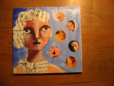
this one by Susy Jack on Etsy. I did a painting yesterday which I am going to put in the shop-and I always worry about photos for the shop, so it was fun to try something different. Apparently (you may already know this) a shot of just the product is called a hero shot-as opposed to a styled shot-one with props of some kind that tell a story related to your product, or highlight an aspect of it or how you made it. Or-show it in context with other of your products. I am badly rewriting the article-it is very well written and interesting, so if this interests you, please visit!
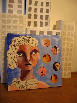
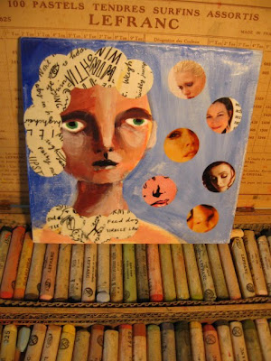
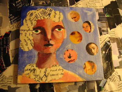
Anyway, I tried my best with a few shots of the painting (product!) I like the one with the pastels the best. I was trying to create a feel of an artist's home, and in the book shots, how the painting could fit into a home. There are two hero shots at the bottom-I prefer the one with the collaged background as it links to the collage in the painting. I would appreciate any ideas/criticisms if you have any!
Ideas-contrasting the circles in the picture with the squares in the background.
As already mentioned-artist's home!
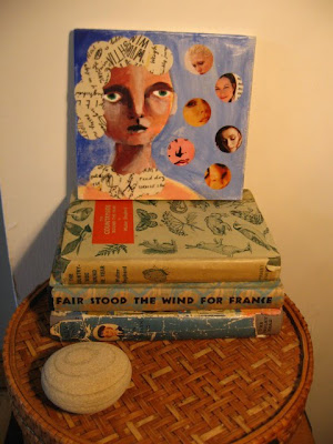
Natural, textures, circle of stone echoing circles in picture, old books-I just like these-not sure how it adds anything! I did deliberately put the orange label under the picture-to compliment the blue.
.JPG)
I like the warm tone of the wood-the top of the desk I sold-to be delivered tomorrow-the man who bought it was going to come on the bus and I felt sorry for him!
.JPG)
Maybe I should do a picture with loads of circular objects-hanging on the wall-might try that tomorrow!
Back to work soon, no more time for all these extremely fun and important activities!

 As already mentioned-artist's home!
 Natural, textures, circle of stone echoing circles in picture, old books-I just like these-not sure how it adds anything! I did deliberately put the orange label under the picture-to compliment the blue.
.JPG) I like the warm tone of the wood-the top of the desk I sold-to be delivered tomorrow-the man who bought it was going to come on the bus and I felt sorry for him!
I like the warm tone of the wood-the top of the desk I sold-to be delivered tomorrow-the man who bought it was going to come on the bus and I felt sorry for him!.JPG) Maybe I should do a picture with loads of circular objects-hanging on the wall-might try that tomorrow!
Maybe I should do a picture with loads of circular objects-hanging on the wall-might try that tomorrow!
14 comments:
Sounds an interesting article, useful too. I like the first photo, I think the neutral colours of the background shows the painting off well.
Yes the man in my photo was difficult to see. He looked like a thicker post in the vineyard. I could pick him out because I knew he was there. It was really to show how far away he was and that he caught the dogs eyes. They are atrracted by the movement.
Enjoy your weekend.
Very interesting Sarah...you should be a natural at this!
I'm liking those circles a lot! Funnily enough, I've just learnt how to "crop" photos in indesign into circles and my big plan is I'll be able to do that for blog photos...well if I ever get round to it of course! But I'm totally into the circle thing going on here!
P.S. Thank you so much for that link to the vintage site - had a look around - great blog!!!
A beautiful painting Sarah- wow that caught my eye- I really love it against the squares (or what looks to me like a cityscape) - fantastic all!
The painting is just perfect as a model to show what is meant by all these backgrounds and whathaveyous.
The warm wood is so so beautiful. Can't beat that colour.
Thanks for the links, too.
Say, somebody from *London* sent me a fun and artistic birthday card -- and it got here on the exact date!
Take care,
Candace x
Oh Sarah, this is such a cool post! I especially like the painting on the pastels- AWESOME indeed! Thanks for the link to the "how to". Very informative- I am starting to list some buckles and stuff on Etsy soon- this has me rethinking how I photograph them.
Cheers! Lv your painting.
I definitely prefer the one on the box of pastels. v chic
your posts are always so creative!
Your painting~ collage looks good, Sarah!!
Have a creative day!
xox
Constance
So here are the results of the Cavers jury ..... Malcolm has voted for ..... the first photo. I have voted for the ..... third photo! But of course the more important thing is your painting - fabulous
It is hard to choose one backdrop, as each enhances the painting in unique ways. I do rather like the drama of the first photo provides--very exciting. But I also very much like the softness, almost tenderness of the painting set against the box of pastels too. I am intrigued how each backdrop enhances the painting! Photo styling is an art in itself! But your painting alone against a white wall would be terrific too! ;o) Happy Weekend, Sarah ((HUGS))
I like the first one with the quiet background; the 'artistic' one and the one with the books can help determine the size of the painting but I think there's too much going on there.
Beautiful work, by the way.
I like the one with the pastels the best. What would happen if you used that background, cropped in a bit, and lowered the camera angle so that the subjects eyes were the primary focus, as if you were taking a portrait? Just a thought.
The links are most welcome, as I was just thinking today of trying some staged photos myself. I'm taking it as a sign. LOL
Thanks for all the feedback-most appreciated!
Post a Comment